
How a folder of SVGs becomes a font
Hi!
I wrote icofon — a tool that takes a folder of SVG icons and builds an icon
font out of it, along with a stylesheet and a preview page.
What follows is how it works inside: what happens to a drawing on its way from SVG to glyph, where icofon runs into the limits of the format, and what I had to work out about names and codepoints so that a font can be rebuilt without breaking pages that are already published. If all you want is the tool, the install, the first run and the commands are right below; you can skip the rest.
Install
icofon is written in Rust, MIT licensed. Homebrew installs a prebuilt binary, so there is nothing to compile:
brew install jwo1f/tap/icofon
Or through cargo, if that is more your habit:
cargo install icofon
Sources are at https://github.com/JWo1F/icofon.
First run
icofon build ./icons -o dist
16 icons
  dist/icons.woff2             3.1 KB
  dist/icons.woff              3.5 KB
  dist/icons.ttf               5.1 KB
  dist/icons.css               1.3 KB
  dist/index.html              35.4 KB
  icons/icofon.json            1.4 KB
A page needs two lines:
<link rel="stylesheet" href="icons.css">
<span class="icon-check"></span>
To a browser a glyph is text: it inherits the surrounding font-size, and a
single-color one inherits color as well. So you never set an icon’s size, and
for a single-color icon you never set its color either; color icons behave
differently, and they come up below.
Three more commands
icofon check ./icons          # convert everything, write nothing
icofon watch ./icons -o dist  # rebuild whenever an icon changes
icofon init  ./icons          # write an icofon.toml
check is the one for CI. It converts every icon into a glyph and fails if any
one of them didn’t make it. It writes nothing along the way — no font, no
stylesheet, no page, no icofon.json.
Anything you would otherwise retype every time lives in icofon.toml. icofon
looks for it up the tree from wherever you ran the command, and resolves the
paths inside it relative to the file itself, so a build behaves the same from
anywhere in the project.
source = "icons"
out = "dist"
name = "icons"
formats = [
    "woff2",
    "woff",
    "ttf",
]
prefix = "icon"
A font can only fill
A glyph is an outline filled by the non-zero winding rule.
There is no such thing as a stroke in a font. An icon drawn with
stroke="currentColor" and no fill — which is most of Feather, Lucide and
Tabler — gives you nothing you could carry over: every stroke has to be traced
into an outline of its own first, keeping its width and the way it turns at caps
and joins.
Four libraries split the work from file to TTF. usvg 0.48 parses the file and
turns primitives into paths; tiny-skia-path, which comes along with it, traces
strokes into outlines; kurbo does the rest of the geometry; write-fonts
assembles the font tables. Flattening the paths into one list is icofon’s own
job, and so is turning cubic curves into quadratics — kurbo does the actual
approximation — because quadratics are the only curves TrueType stores.
SVG also has fill-rule="evenodd", which plenty of icons use to punch holes,
and fonts, as noted, only know non-zero winding. Carrying those contours over as
they are fills in any hole wound the same direction as the outer contour. The
fix is to reorient every contour by nesting depth: winding direction takes over
the job the fill rule was doing.
And the metrics. The viewBox height maps onto one em, and an em here is a
thousand units: from 200 below the baseline to 800 above it. An icon drawn edge
to edge in its viewBox comes out exactly 1em tall and sits level with a line
of text, with no vertical-align propping it up. Width scales by the same
factor, so a non-square icon keeps its proportions and can be noticeably wider
than one em.
White is not a color
A glyph has neither color nor opacity — only an outline and the fill inside it. So there are two things in an SVG you cannot carry over as they are.
The first is a white shape. examples/icons has badge-colour.svg in it: a
blue disc with a white check stroked on top. Carry them over literally and you
get a filled disc — the check becomes ink in exactly the place the drawing asked
for none.
The second is a faint fill. Next to it, in shapes/, sits tinted-ring.svg: a
ring with a mark inside it and a backing of the same color at opacity="0.2".
A glyph has no opacity, so that backing would fill at full strength and swallow
everything drawn over it.
Both are handled the same way. Shapes are visited in paint order, and what each one means is decided by whatever already lies beneath it. Over ink it is a knock-out: the contour is wound the other way and becomes a hole. Over nothing it is background, and it gets dropped. Only a contained shape can be subtracted — though containment is checked on bounding boxes, which is crude.
The faintness threshold is 0.5 and the whiteness threshold is 0xF0 per
channel. I picked both numbers out of the air, and both are still holding.
The rule has an exception, without which it wrecks perfectly good artwork. An icon drawn entirely in white, or entirely as a faint wash, is just a light icon, and it has to be drawn. So the rule only kicks in when the file has at least one shape at full strength.
When the color can’t be thrown away
The rule from the last section fires on badge-colour.svg itself: the blue disc
with the white check reduces to a disc with a hole instead of a solid blob. For
a single-color glyph that is the best available outcome — but there is no blue
left in it. So icons that use more than one color are emitted as COLR/CPAL
layers, which is the OpenType mechanism for exactly this, and they render as
drawn. The flattened contour with that hole in it doesn’t go anywhere: it stays
on as the base glyph, the one a renderer without COLR support will show. The
rules about white and faint fills no longer apply inside the layers — real
colors are available there, so the check stays white on a blue disc.
Layers painted with currentColor get palette index 0xFFFF, the value
OpenType reserves for the text color. That is how one icon holds a pinned color
and a color that follows your CSS at the same time.
The harder call was when not to do this. An icon in one flat color —
currentColor or a hardcoded dark gray — stays a plain glyph. What color buys
you is the relationship between colors, and one color has no relationships to
preserve. Pinning it only takes away the icon’s ability to be recolored and
freezes it in whatever single color happened to be in the file, even where that
color disappears against a dark background.
What won’t become a glyph
Some SVGs cannot become glyphs at all — there are three such cases, and passing them through silently is not an option.
The first is a bitmap wrapped in an SVG. A PNG pasted out of a design tool
arrives either as an <image>, where there is nothing to trace, or as a fill
through a <pattern> — and that fill would be traced along its own contour,
which is usually a rectangle, and come out as a solid black block. The second is
artwork shaped by a <mask>: a mask decides per pixel how much of each shape
survives, and an outline cannot express that. The third is a file with nothing
drawable in it at all. The build fails and names every offender at once, so a
large set gets fixed in one pass; --on-error skip builds the font without them.
Here is what the build does not catch. A gradient collapses to its first color, because a layer is one flat color. A fill weaker than half opacity is read as background, by the rule from the section on white, with the same caveat about a shape at full strength; anything denser is drawn solid. Text that wasn’t converted to curves drops out just as quietly: it yields no contour, and if there are shapes beside it, the empty-glyph check won’t catch it. The file converts successfully, it just doesn’t look the way it did in the editor.
My favorite failure of this kind is already fixed. usvg recognizes only the
exact spelling currentColor and throws the paint away otherwise. SVG keywords
are case-insensitive, design tools happily write currentcolor, and an icon
spelled that way lost all its strokes and compiled into an empty glyph. No
error, no warning, just an empty space. The input is normalized before parsing
now, and a file that still compiles to nothing runs into the empty-glyph check,
which arrived in the same commit. But that is one keyword caught by hand; it
doesn’t close the class.
Names, paths and codepoints
The most boring part. Whether you can rebuild the font without breaking anything depends on it.
The file name becomes a CSS class: lowercased, slugified, prefixed by whatever
subfolders it sits in. arrows/left.svg is .icon-arrows-left, and two folders
can each keep a left.svg without clashing.
Icons get characters in the Private Use Area starting at U+E900. The naive
approach hands them out in file-name order on every build, and that works
beautifully until somebody drops in aardvark.svg. It sorts first, takes
U+E900, and every icon after it shifts by one position. The font still builds,
the CSS is still valid, and a browser holding the old CSS in cache pairs it with
the new font and shows the wrong icons without complaining about anything.
So icofon.json sits next to the icons, and it wants to be committed. Its key
is the file’s path: an icon’s name can change because a neighbor showed up, and
its path stays put. A codepoint is never handed out twice, even after the icon is
deleted — otherwise cached CSS will one day quietly show a different picture.
A codepoint can be pinned by hand, with a prefix on the file name:
uE9F0-star.svg gives .icon-star at \e9f0. And map-pin.svg and
map_pin.svg reduce to the same slug — duplicates like that fail the build, and
it lists every clash at once; --on-duplicate number numbers them and ties the
number to the file itself, in icofon.json. The build used to number them on its
own, with no say in it, which turned out to be a trap: a third clashing file that
sorted first renamed the others, and their codepoints moved along with their
names.
Separately, about rebuilding: the font builds reproducibly. head.created and
head.modified, where TrueType keeps its dates, hold a fixed number. They used
to hold the current time, so the same icons produced different bytes, and a file
committed next to its sources showed up as modified after every run.
Three containers
WOFF2 is brotli-compressed, every browser has understood it since 2016, and in practice it is the only one anybody downloads. WOFF is deflate — the fallback for anything older. TTF is not compressed at all and is what desktop apps and non-web tooling want. All three wrap the same contours, nothing is redrawn; the stylesheet lists them smallest first, and the browser stops at the first container it understands.
The prefix claims every name
By default the styles attach to any class that starts with the prefix:
[class^="icon-"],
[class*=" icon-"] {
  font-family: 'icons' !important;
  …
}
Nothing to remember: add an icon and it works. The cost is that the whole
icon-* space now belongs to the font — your own .icon-button, or a utility
class out of some framework, picks up the icon font, and through !important at
that, so an ordinary rule won’t override it.
--base-class works differently. The prefix becomes a class in its own right,
every rule requires it, and the markup gets wordier — class="icon icon-check"
— but nothing is claimed by name anymore. The !important is still there; only
what it covers changes. This is the mode to use when you’re dropping the font
into a codebase you don’t fully control.
The preview page
A build writes index.html. This page was meant to be a one-time sanity check,
and I end up opening it more than everything else that lands beside it.
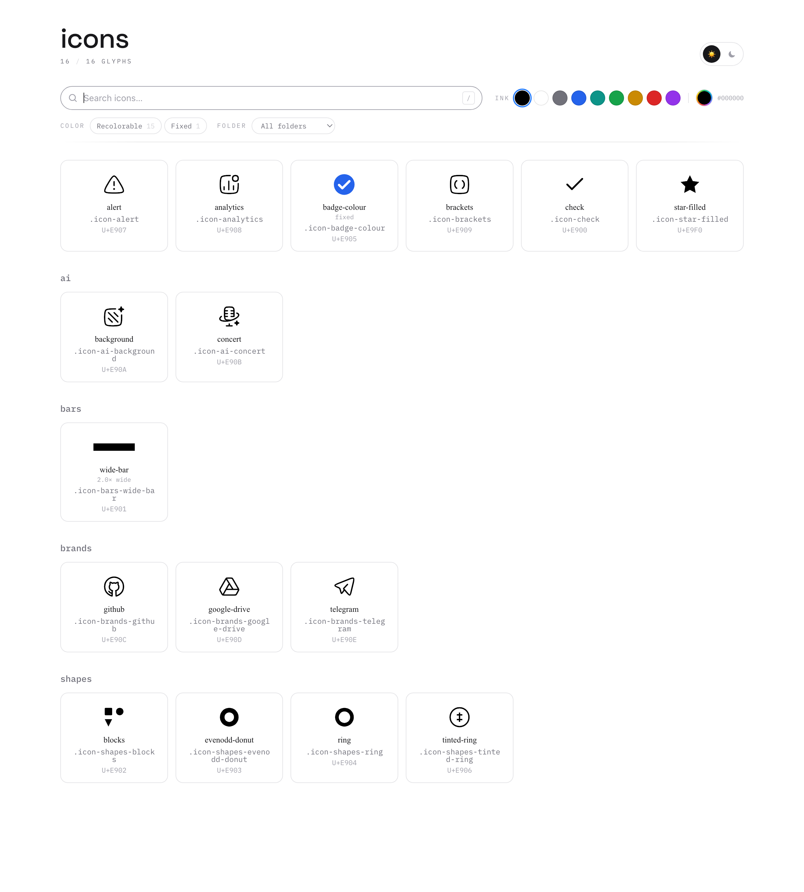
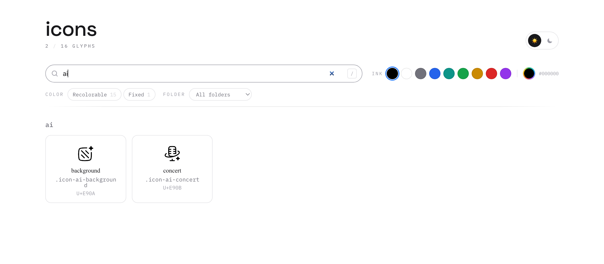
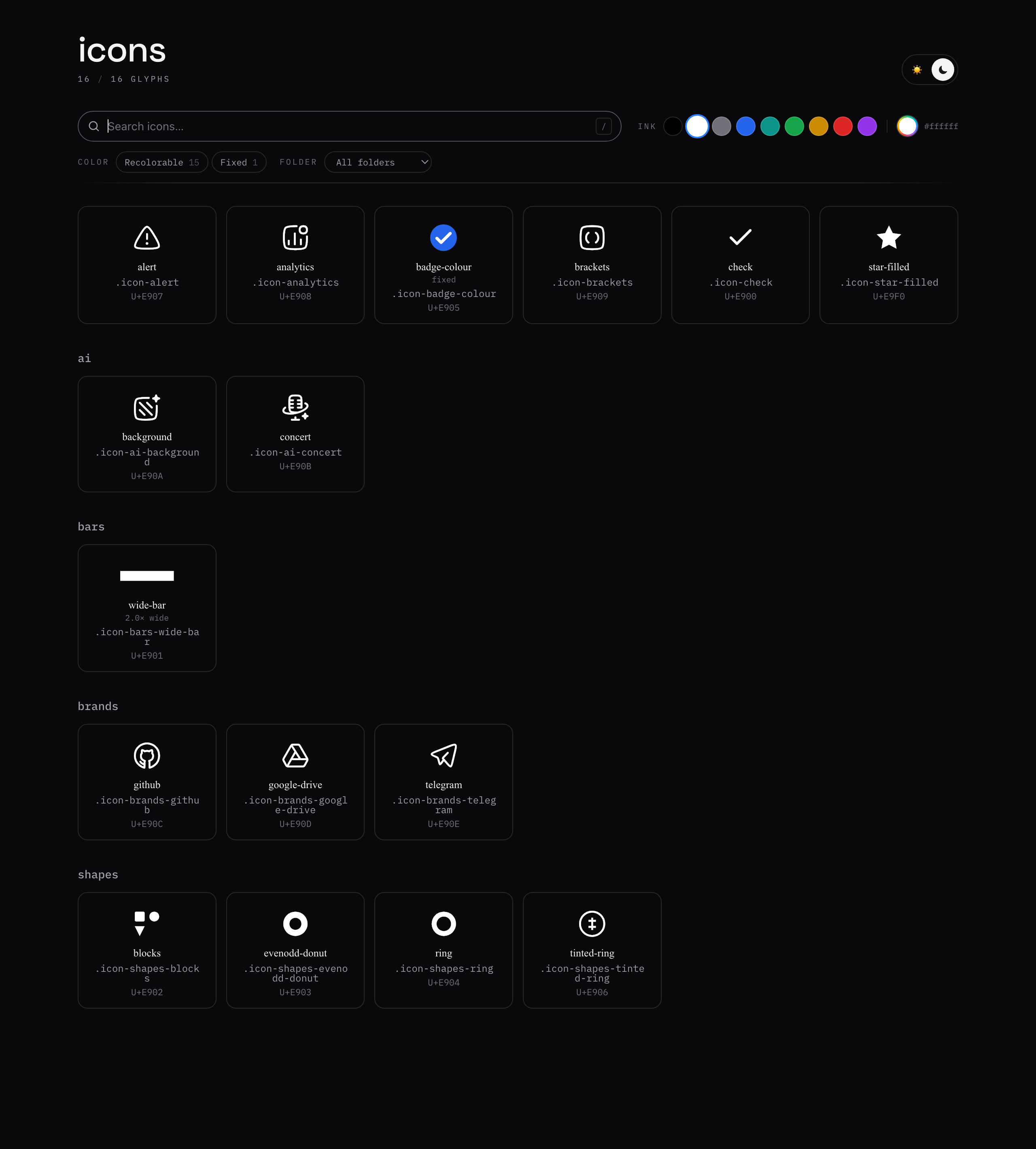
A card carries the name, the selector, the codepoint and, where there is
something to say, a note about width or color. Search matches the name, the
class, the folder and the codepoint in hex — without the U+ — and also the
state words, fixed among them, which comes up below. Clicking the class line
copies the class itself, the thing you paste into class. Subfolders become
sections.
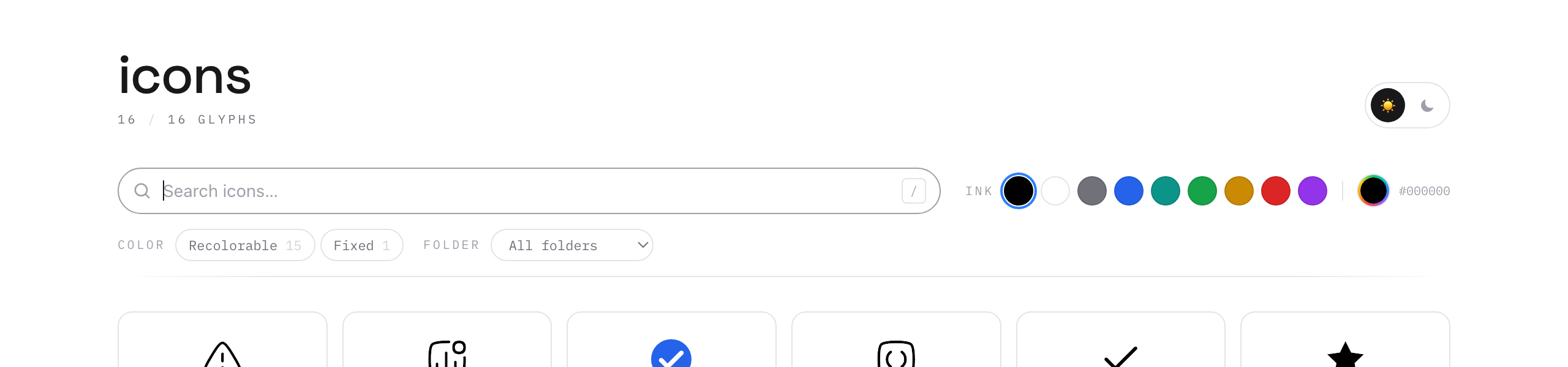
Besides search there are two filters, and all three work together. The folder one narrows the set to a subfolder; the color one splits it by how much CSS can affect an icon: entirely, partly, or not at all. This set only has the first and the last. Higher up in the same toolbar sit the color swatches and a picker for any other color. The theme switch is higher still, in the title row. It is there because icons are drawn on white and end up wherever they end up.
Any of the three narrows more than the grid: groups left with nothing collapse along with their icons.
The chosen color applies to the glyphs only, so the labels stay readable:
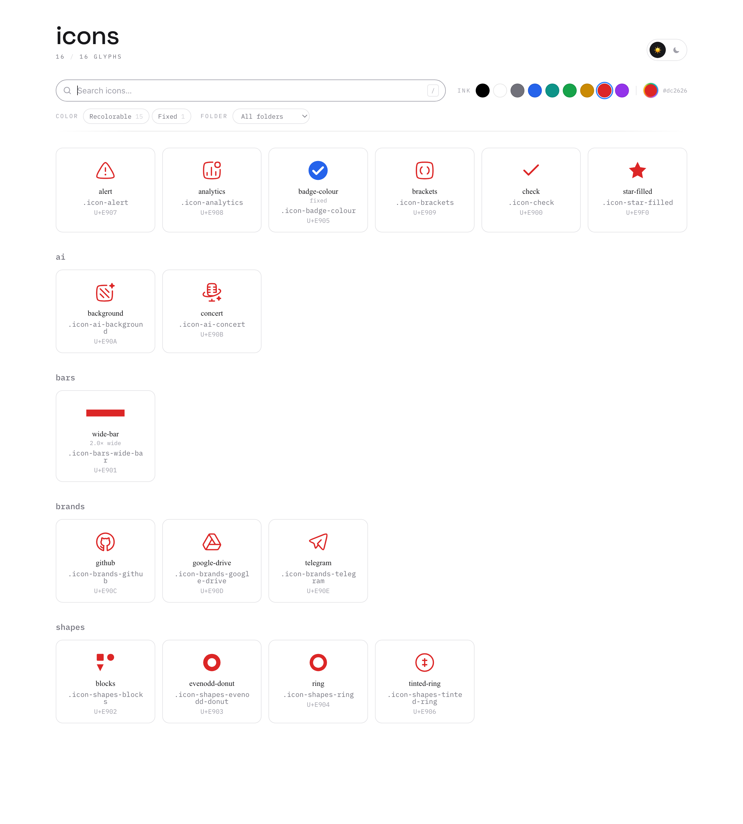
Fifteen icons went red. badge-colour stayed blue, because that blue lives in
the font rather than in your CSS — and its white check stayed white for the same
reason. The card says fixed. The “Fixed” filter pulls those out in one click.
Then I set the color back to black and flipped the theme. There was no need to pick a color again: black turned into white on its own — those two swap when the theme changes. Any other chosen color would have stayed as it was, red included.
Two things on this page I underestimated. A card has to know its icon’s aspect
ratio. The widest one in the examples is wide-bar, twice as wide as it is tall,
but a wordmark can be several times wider than that and will simply run off the
edge if nothing scales it down.
A sticky toolbar has to hold one height. The moment it changes, it shifts the content underneath, the browser compensates with scroll anchoring, and from there the two fight — which you can see on small scrolls right at the point where the bar sticks.
There is one thing here I’m not happy about. The page links the generated stylesheet, so it renders with exactly the CSS a site would use — but its own layout pulls Tailwind and web fonts off other people’s CDNs. Offline it looks wrong; none of that touches the font or the stylesheet.
What it costs
The price of an icon font is accessibility. A glyph is not a picture, and it has
to be hidden from screen readers with aria-hidden. And if the font fails to
load, the Private Use Area character falls through to a fallback face, which
usually draws a box: where the icon should be, you get garbage. So anything that
carries meaning is better left as an image with alt text. For interface
plumbing — the chevron in a dropdown, the close button — I’ll take that trade.
If you try it and something breaks, an issue or a pull request at https://github.com/JWo1F/icofon would be welcome. The interesting ones are SVGs that convert without an error but come out wrong: I only ever find those by looking.
Comments 0
No comments yet.