
Sparkline — from curl to a chart in one request
Here is a small service that solves exactly one problem — drawing charts. Charts of what? Of absolutely anything: from the load on a machine to the likes under your post.
The idea is simple: you already have the number. CI prints the build time, the worker knows the queue depth, the deploy script counts the deploys, and the database counts the likes. The only thing missing is somewhere to send that number and a picture to look at afterward. No library in your lockfile, no daemon on your box, no header with a token to remember.
The service sparkline.ivashkin.dev Three charts of 256 samples, free and with no card. A minute to make one, and one line of curl to keep it fed.It starts with a minute in a wizard
The whole thing works as simply as it possibly could. Like any service, it starts with signing up, and after that there is a wizard of a few steps. The first is the chart’s name, and there is nothing to linger on there.
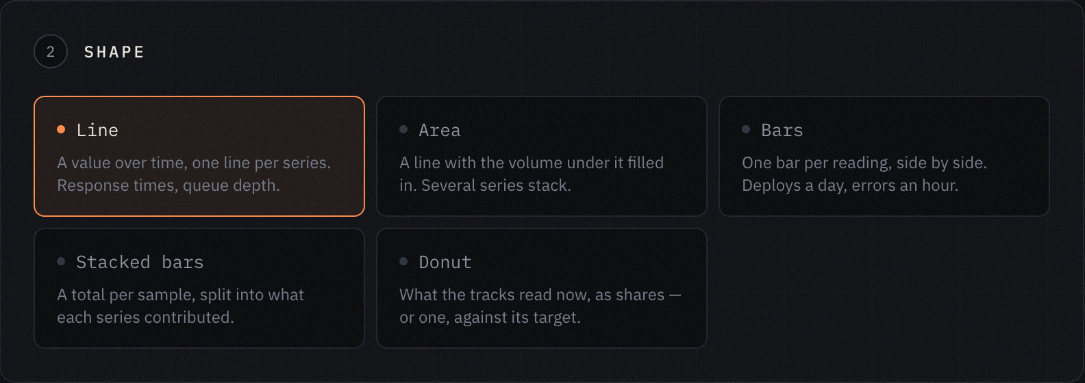
The second is the shape, and there are five. A line is a value over time, one line per series: response times, queue depth. An area is that same line with the volume under it filled in, and several series stack on top of each other. Bars are one bar per sample: deploys a day, errors an hour. Stacked bars are a total per sample, broken down into what each series contributed. And a donut is what the series read right now, as shares of what they add up to; a single series in a donut is measured against its target instead.
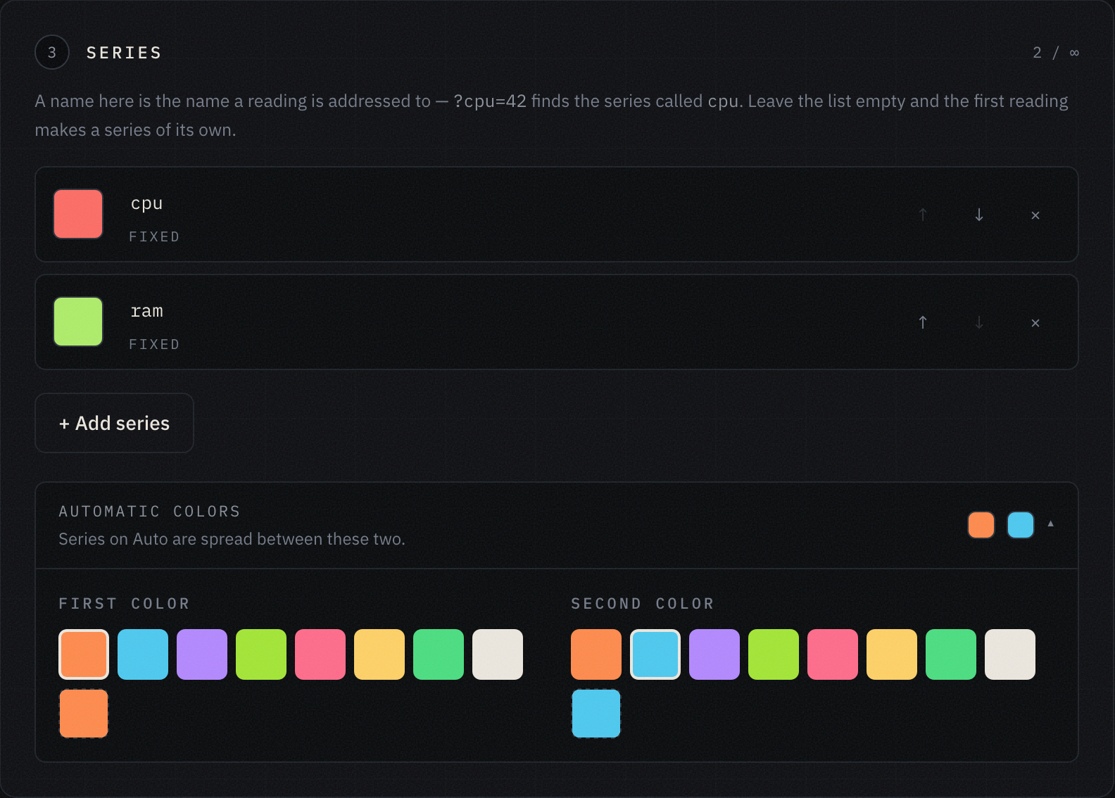
The third step is the series. A series name here is the same name a reading is later addressed to: ?cpu=42 finds the series called cpu. This is where you can — though you do not have to — decide up front how the different series on one chart will look. Yes, one chart can show several lines at once. You can also leave the list empty: a series will then create itself from the first reading that names it, and its color will come out of the gradient between the two you picked. All of it can be edited later.
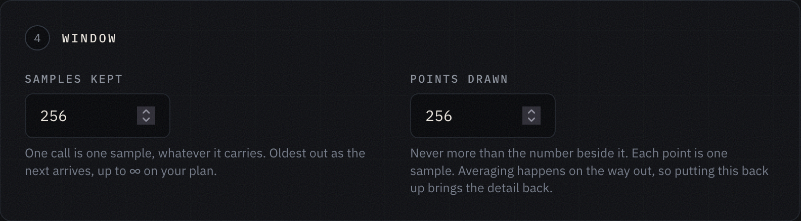
The fourth step is how many points the chart keeps and how many points it draws. These are two different numbers, and the difference between them matters more than it looks.
The first is the size of the window. One request is one sample, and the moment a new one arrives the oldest one leaves — in the same transaction, so the chart is never even briefly larger than its own window. This is a window, not an archive: the service does not keep history, it shows the last N samples. The second number is how many points make it into the picture. If it is smaller than the first, neighboring samples are averaged on the way out, and the detail comes back by simply raising the number again — nothing was thrown away. On the free plan the window goes up to 256 samples, on the paid one up to 4096; the paid one is $3 a month, which is just about what the server for this service costs.
The fifth step is what exactly is visible on the picture. There are four toggles:
- Value gridlines — rules at round numbers, with the figures down the side.
- Time axis — labels spread along the whole bottom edge, not only under the newest sample.
- Legend — which series is which color, and what it reads now.
- Start the axis at zero.
The last one is worth stopping on, because it is the only toggle here you can wreck your own picture of the world with. For counts, zero at the bottom is the only honest option: a bar floating above its own baseline lies about how many times bigger it is than the one beside it. But a series that lives in a narrow band gets flattened by that same zero: CPU load wandering between 40 and 46 percent turns into a straight line along the floor, and you stop seeing the very thing you drew it for.
Which is why it is off by default for lines and on by default for bars.
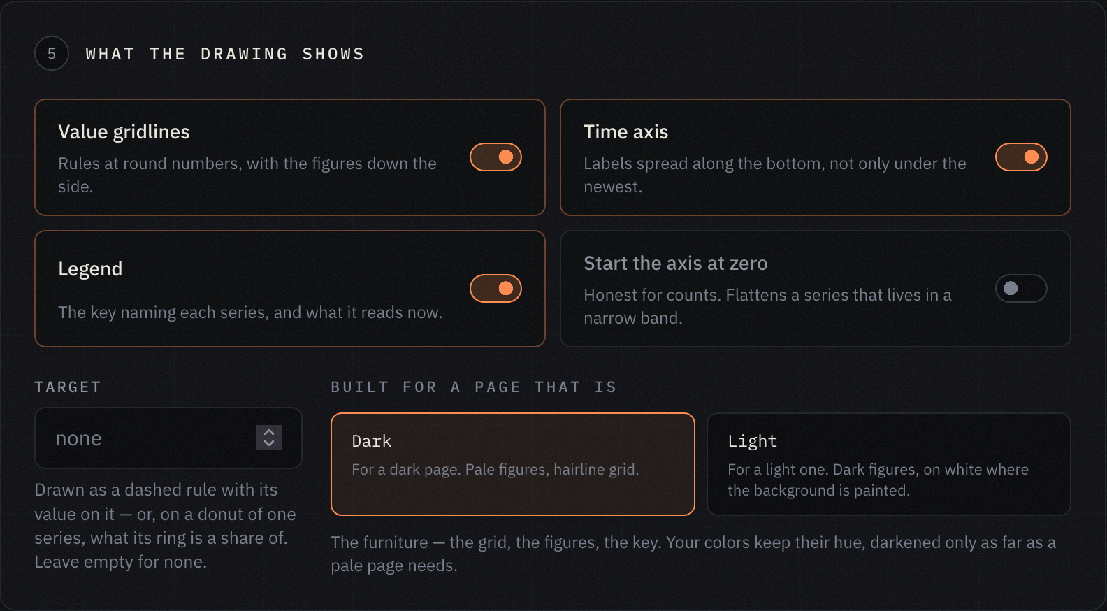
This is also where you set a target value — drawn as a dashed rule across the chart, and on a donut of one series it becomes the thing that series is shown as a share of — and the theme: for a dark page or a light one. Only the furniture changes with the theme, meaning the grid, the figures and the legend; your series keep their colors.
That is all. Your chart is ready, and you get two codes: a public one and a private one. You will need both in a moment.
After that, one line does the work
This is the interesting part. Data reaches the chart in a single request. Remember the two codes you got when you created it? Here is where they are used.
curl -fsS 'https://sparkline.ivashkin.dev/i/e48z7fg5ke9k3tv5xy3npwz4v5enhwbp?cpu=42&ram=17'
That is it. e48z7fg5ke9k3tv5xy3npwz4v5enhwbp is the private code you got after creating the chart, cpu=42 puts the value 42 into the series cpu, and ram=17 puts 17 into ram. If there is no series by that name yet, it creates itself.
One request is one sample, however many series it carries: the time axis gets one tick, not two. You do not send the time and you cannot — the axis runs on the service’s clock, which is exactly what lets a request consist of nothing but numbers.
The response comes back in the same shape whether it worked or not, so jq -e .ok is already a complete check:
{"ok":true,"chart":"Demo","values":{"cpu":42.0,"ram":17.0},"created":["ram"],
 "points":256,"capacity":256,"series":["cpu","mem","ram"],
 "url":"https://sparkline.ivashkin.dev/g/hvej9gpqjz5u"}
created is the field to watch: those are the series this particular request invented. The line above is real, and you can see me fumbling my own example in it — the demo chart had cpu and mem, I sent ram, and the chart quietly grew a third track. Nothing is broken here, it works as designed, but you would rather learn about it from the response than off the picture a week later.
Besides the query string, the same address takes a form body and JSON — for when the number does not come from a shell:
curl -fsS -d cpu=42 -d ram=17 https://sparkline.ivashkin.dev/i/KEY
curl -fsS -H 'content-type: application/json' -d '{"cpu":42,"ram":17}' https://sparkline.ivashkin.dev/i/KEY
Gaps are worth knowing about separately. A dash or an empty value is not a zero but a hole: the line breaks there and the bar is not drawn at all. So ?cpu=$CPU with CPU unset records the moment rather than a floor nobody measured. The difference between “the value here was zero” and “we did not know the value here” is the one thing a chart cannot get back after the fact.
After that you just repeat the request whenever you have new data, and it shows up on the chart right away. Take your favorite programming language, or curl and cron, or whatever else — and you have a powerful charting system in one line!
Before this goes into cron
The private code is the entire password. It sits in the path rather than in a header, and that is a deliberate trade: the line fits in a Makefile, and a chart of build times is not worth an OAuth flow around it. Whoever holds that code can do exactly one thing — add readings to this one chart. Not read its settings, not delete it, not reach any of the others. Pasted into the wrong Slack channel, it rotates in one click, and everything embedded by the public code keeps working.
Writing over GET is the same kind of trade. A request that changes state is supposed to be a POST, and POST is right there at the same address. But what fits on one line of a Makefile is GET, and the rule is broken deliberately for that. What to keep in mind is the other side of it: somebody else’s proxy is perfectly entitled to repeat such a request, and curl --retry all the more so, and that is exactly where a spurious tick on the chart comes from.
The limit is 120 requests at once, then 120 a minute per code. Requests are counted, not numbers: one request carrying six series costs exactly what one carrying a single value costs. Past the limit you get a 429 with a Retry-After header and the same number in the body, so a backoff is one line and involves no guessing. Of the other answers, two are worth knowing: 404 means no chart has that private code — and the same answer comes back for a code of the wrong shape — and 422 means there was nothing to record, since infinities and NaN are refused rather than stored.
And a DELETE to the same address empties the chart. It does not delete it: both codes stay, along with the series, their colors and everything you have already embedded. Only the readings go — which is what you want when a chart has survived a migration and the old numbers are no longer about the same thing.
The picture lives at an address of its own
Besides the dashboard that shows every chart at once, you can embed a chart in your own page, in a README on GitHub — anywhere at all that accepts an SVG image.
For that you take the public code and use it as an image:
https://sparkline.ivashkin.dev/g/hvej9gpqjz5u.svg

The picture is drawn at the moment it is asked for, so it is never showing yesterday. The size is fitted with ?w= and ?h= — clamped rather than refused — and below roughly 320×120 the axis labels drop out on their own: at that size they are bigger than the chart. A table in a README and a screen on a wall want different sizes, and neither should require a second chart.
On top of that, there are two more ways to share a chart.
The first is a <script> you embed in your own site:
<script src="https://sparkline.ivashkin.dev/g/hvej9gpqjz5u.js"></script>
And here is that same chart, dropped right into this page by that tag:
Above was a picture; this one is a chart — hover over it and you get the details for every series. ?fill=1 stretches it to the width of the column, ?refresh=60 redraws it once a minute — ten seconds is as fast as it goes, and in a background tab the refreshing pauses. The chart is inserted synchronously and exactly where the tag stands, and the tag itself disappears. It is drawn inside a shadow root that your page’s stylesheet cannot reach into, so somebody else’s CSS cannot touch it — and the other way around. Several such tags on one page do not get in each other’s way.
The second way is a public page, open to everyone with no account and using only your public code: https://sparkline.ivashkin.dev/g/hvej9gpqjz5u. It carries the same live chart, and you can send it to anybody.
And if the chart is wanted by a program rather than a person, .json appended to that same address returns a table: series are the columns, samples are the rows, and null is a series that particular sample did not measure. None of the three addresses needs authorization, and not one of them can write.
Try it from right here
Sparkline is a simple but powerful service for making charts and filling them in about as easily as that can be done. The links I left in this post are live, and the private code is real too: you can send a request to the URL printed above and watch your own value appear on the chart. You do not even need to sign up for it.
And yes, the chart in this post is shared by everybody. Anyone can write to it — which is precisely what I am asking for. If you opened this page and found somebody’s nonsense on the picture, then it all works.
Comments 0
No comments yet.